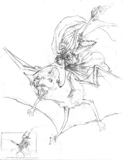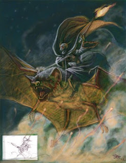

I forgot to blow the drawing up so when I shrank it down the painting would tighten up at its normal size. Sooo, this reproduces well at half its size. That's okay, though. It ends up being about 5"x6.5", which means it's nearly cover size. HOWEVER, the dimensions are closer to a magazine proportion. So, in the end, I'm calling this a glorified colour study, lol. Which it is, anyway. It was an experiment and has the little thumbnail I used to layout the final design in the bottom left corner.

That's really cool Justin!
ReplyDeleteI love it!
ReplyDeleteI wish I could create a color piece that quickly.
Is the bat large or the skeleton tiny?
Thanks, guys! :) Chuck... I'll let you be the judge of that :P
ReplyDeleteJustin, Your painting in Photoshop is getting better and better. That looks like it might be pastels on dark Canson paper, for example. It looks hand-rendered. I like the two light sources - the cold blueish gray which must be moonlight, and the warm light from the fiery mace. Please bring the original sketch/drawing to the Illustrators Lunch.
ReplyDeleteInterestingly, enough, it kind of is painted on a toned paper. I paint digitally exactly how I paint with oils and with pastels (heck, even with watercolour). I place the drawing down, then create a layer on multiply at anywhere from 2o-5o% (sometimes higher). I then paint on that layer all of my darks and mid tones. Then I create another layer that is used expressly for highlights. I made a handful (literally only about 1o) of custom brushes that give me the effects of paint brushes, pastels, etc. I only ever use about two or three of them at varying point sizes. One I like very much I used for the smoke. It has a very grainy texture and lays down colour that looks like it just soaked right into the surface.
ReplyDeleteI hate complexity, so I treat digital like I treat traditional. I keep layers down to three, max. I only use a handful of brushes. My palette for this consisted of maybe ten colours (of which I used only about four regularly). The underolour is a hunter-like green. Simplicity, simplicity, simplicity. Like a samurai, or the sumi brush artist. The purpose is to make as few strokes as possible to achieve your end.
This comment has been removed by the author.
DeleteOh, and I cannot bring the drawing. I scanned it a gave it to my bro for part of his birthday present :P I'll upload the drawing here for you, instead :P ... Dude... click on the pencil drawing, then use your left and right keys to move from one image to the other... trippy... but cool :P
Delete