Showing posts with label fantasy art. Show all posts
Friday, October 12, 2012
Some New Stuff
So, it's been awhile. I moved and don't live near enough to Pam to get to anywhere easily. I'll see about bringing my girlfriend to a lunch group soon. I'm also working on my license, which, when reestablished, will allow me more freedom to join you all. In the mean time, here's some new stuff. All of this is digital, save the obvious graphite piece.
Hope you're all doing well. I'll hopefully be adding more soon.
Friday, March 16, 2012
'Dragon Eye'


Here's where I stopped on this new painting yesterday. I also have more work done on 'The Last Unicorn'. I think that one is going to take a while before I'm satisfied with it... Some are like that, I guess. Plus, I have to create the type. I want to do some cool thing with the 'u' in unicorn where it is a Celtic- or illuminated looking red bull. And something needs to happen with the sky. Something to break up the monotony of the clouds.
Tuesday, March 6, 2012
New Lessons


Just picked up the new FX magazine. It's as good as the last one. James Gurney is in it, again. This time with lessons from Howard Pyle. Dan Dos Santos has a great composition article, too. This image, along with the two preliminary images, are studies I finished right after reading the two features.
Thursday, March 1, 2012
2nd Cover ~ 'The Last Unicorn' In Progress

Here's the cover for 'The Last Unicorn'. It's getting there. Still lots of work to do. Those of you who saw this yesterday got to see the drawing at lunch. I started the painting at 9 this morning. I'll be working on it till about 6:oo, tonight. So a couple more hours.
I need to acquire some materials for 'The Hobbit' before I finish it. I am still debating whether to do in it oils or digitally. 'The Last Unicorn' is digital. I will do Smaug in oils, now that I think about it. That's a special project for me. In the meantime, I'll be doing some other paintings in the computer (like this one).
The text boxes will have a coloured border and a high key, low-textured, parchment-like field.
P.S. Added the newest update to show where I stopped for the day. Still have lots of work to do (esp. on the unicorn), and not sure if I like the border colour on the boxes, yet. I'm thinking I might make them a blueish colour.
P.S.S. The final, as well ~ unless there is something that looks like it needs changing.
Saturday, February 25, 2012
'Bat Rider'


I was at the Museum Centre looking through a book I purchased for use as bat reference and stumbled across a picture that made me go, '... Hmmmm, this bat needs an evil skeletal rider with a fiery mace! Yes it does! :P I made the drawing a while back, and always wanted to paint it. Tonight it just seemed the right time. Sat down, and three hours later, whapow! Bat rider. Photoshop over a drawing.
I forgot to blow the drawing up so when I shrank it down the painting would tighten up at its normal size. Sooo, this reproduces well at half its size. That's okay, though. It ends up being about 5"x6.5", which means it's nearly cover size. HOWEVER, the dimensions are closer to a magazine proportion. So, in the end, I'm calling this a glorified colour study, lol. Which it is, anyway. It was an experiment and has the little thumbnail I used to layout the final design in the bottom left corner.
Wednesday, February 22, 2012
1st Cover - 'The Hobbit' Final Cover layout and Detailed Colour Study

Okay, so I just got back on here and checked my last post and saw that Chuck and Christina had gone to the trouble of commenting and I didn't respond! I hadn't visited the site in awhile due to business. However, it seems that your concerns were my own, for now I am come to you with the changes you specified, only I left in the shield.
So, here you go :P Sorry I didn't get back to you guys. I forgot about my post. I've been so worried about the front cover image I spent days changing things (removing mostly :P) but to now avail. Christina, you should have said something on Facebook. I would have checked here sooner :P
Friday, February 17, 2012
Finished Smaug Drawing and a Recent Front Cover Update


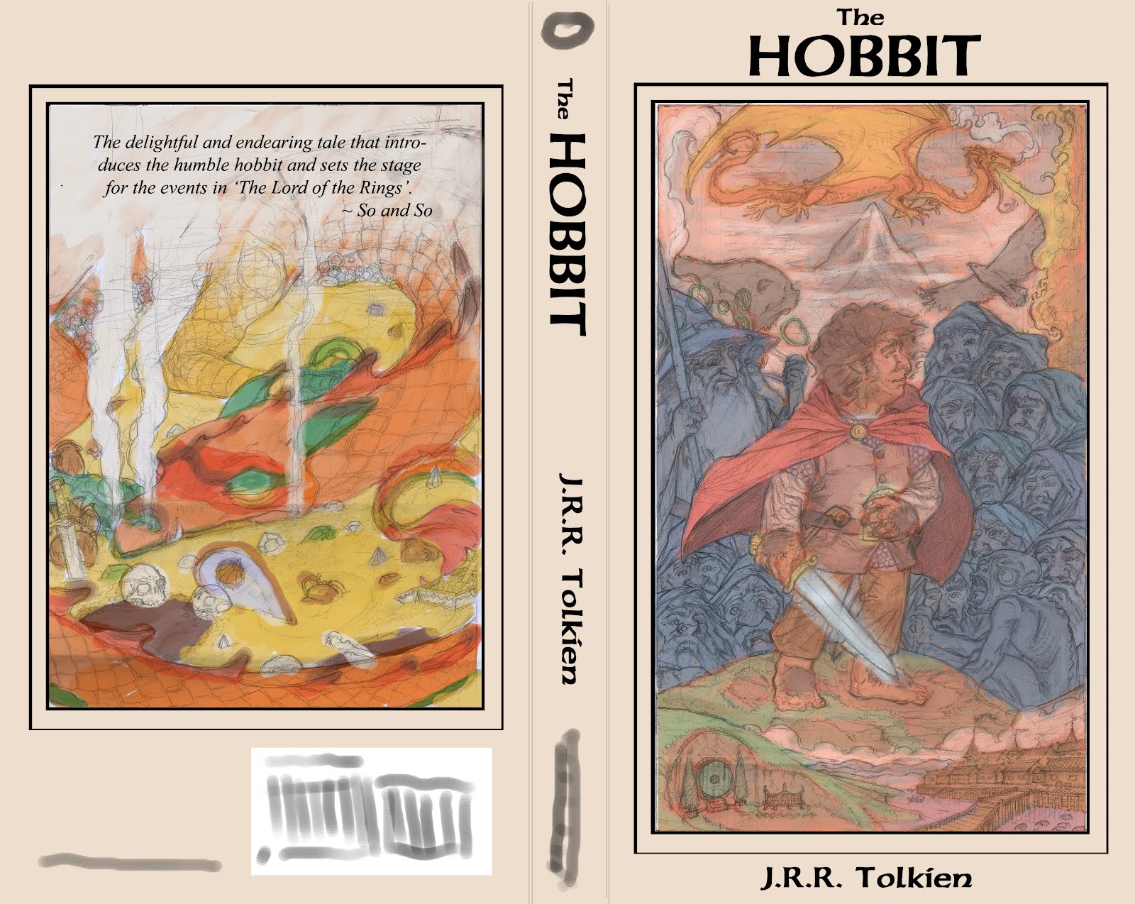
Just finished the back cover drawing of Smaug for 'The Hobbit'. I am working on tightening and making any big changes to the front cover. Here is a recent version with the dwarves all finished. All the characters are famous illustratours that have influenced me in a big way. If any of you have Facebook, you can see who I've tagged there. Otherwise, I'm just going to make a list here.
The Brothers Hildebrandt are Fili and Kili, Pyle is Dwalin, Whelan is Balin, D.K. Sweet is Bombur (he was a big dude), Waterhouse is Thorin, Durer is Nori, Parrish is Dori, Michaelangelo is Ori, Alan Lee Oin, Howe Gloin, Pogany Bofur, and Elmore Bifur. You'll all have to wait to see who Gandalf and Bilbo are :) More to come, very soon. Will probably post the finished cover drawing later today.
Monday, February 6, 2012
After a Slight Delay...


Well, I had finished a monster project and started my cover portfolio, only to be dragged back into the former commission. Now I am done and back on track. Here's the final back cover sketch prior to reference, as well as the final rough layout of the
front and back covers.Thanks,
J.D.R.
P.S. I'm pretty psyched. The back cover image employs the 'Windmill Principle' James Gurney spoke of in his investigation of tonal relationships in 'Imaginative Realism'.
Friday, January 27, 2012
1st Cover - 'The Hobbit'


Hey, guys, here is the in-prog work for my first portfolio cover piece. I am doing 11 covers to various books. I have supplied the first sketch, sans reference (I still need to shoot pics for this
whole thing), along with a colour study featuring where I would like the text to be placed. Any feedback would be much appreciated. The cover will be in oils, but I am doing most of my process work in the computer. Thanks, folks!J.D.R.
P.S. As I worked with this image, I was very unsure of how to proceed. There are some images I don't mind filling the whole cover. Others just don't seem to fit the bill. I also kept thinking, 'Even if I liked this painting, I would not pick this book up off the shelf. I started thinking of all the books I like and what is aesthetically pleasing to me. This final cover layout will change, somewhat, but this is pretty much it. I'll likely do my own text, probably based off of the writing on the map inside the book. Or I may just do something based off of this type-face. I really enjoy it. As for the back cover, I knew I wanted something designy, but related to the front cover in some way. Smaug likely won't break the frame in the final, but this is what I was thinking, in a nut shell. Smaug curled around his pile of gold, his smoke and tail (or maybe just the smoke) curling around the border. Either way, the back image will be bound by the same border as the front. Also, not too keen on the black I used for the text and border around the front cover image. I'll probably choose something more subtle.
Wednesday, September 28, 2011
Middle Sea Blog

Hey, guys. I've been out of circulation for a bit. My internet's down. I'm going to post more, starting with a project I'm doing when I have some down time. I'll post my new map, soon, too. TAG's got me working on another project for their Hellfrost setting.
Here's the link to my blog: www.middleseachronicles.blogspot.com (I can't remember how to hot link things, so unless Christina fixes this, please copy and past the link)
The purpose of this blog is to explore lots of ideas and materials and just have fun. It's a place for me to feel no pressure about art and let loose when I need to.
Enjoy, guys! See you at lunch, soon!
J.
And one image from the blog, just so there's some art up in this post :P)
Friday, August 12, 2011
Wednesday, April 13, 2011
Rough Interiour Layout for 'Epic Tales'
Monday, April 4, 2011
Calendar Cover


Hey, guys, I'm working on a calendar for 2012. This is the cover sketch I came up with. Any feedback would be great. I also uploaded a more detailed sketch in which I tweaked some tangents and laid in some text to hold the spot till I find the type-face I want. This is a really fun project :) Can't wait to see how the months are gonna turn out :)
Thanks,
J.
Monday, March 28, 2011
'Epic Tales' Cover Page Design


Hello, all :) I'm pleased to present to you the final design for the 'Epic Tales' adventure series for Labyrinth Lord. A friend and I are co-conspiratours in a project to be released through my company, Epic Werkes Studio. These adventures will be the forerunner to my own, personal, project. Each cover will feature the same layout, but the colour background will change depending on the image. The images for each adventure will be free to break the bottom and sides of the framed space. The circular region before the book will feature the number of each adventure in the series. My friend is the writer, I am the designer, illustratour, and layout person. So, I am in charge of figuring out the consistent format each adventure will follow. The logo (with the book, but not the banner) will be able to be used, separately, to advertise the product. In some cases, the banner will be present in ads. Currently, the adventure is already written and in the editing process. I have cleaned up the text and made a few changes to the serifs and kerned some of the lettering. I have also transferred the banner and logo and begun painting them. Then, I will set up the layout for the book in Indesign. These are intended to be pdfs, and will be able to be downloaded from RPGNow. I am designing a full front and back cover so that they may be printed in their entirety. This way I can take physical copies to conventions and hand out as promos to gaming stores... Plus, I am not a fan of pdfs. I hate reading things online :P The tentative release date is the end of the Summer. There is lots of work to be done :) I've also included a file of the cover mock-up. It's rough, but it should give you guys an idea of the final design, with the painted logo in place. The logo is in watercolour. The image is an old pic I pulled from some work I did a while ago. It serves only to fill the space and give an glimpse of the final layout with a 'real' image in place.
Sunday, January 2, 2011
"Orthe" logo sketch

This is a personal logo project for a world I'm working on for a role-playing game. It's just some fun I'm using to practice my typography skills and graphic design. I drew it on a spare piece of yellowish paper (just in case you wonder :P) Any info and crits about the layout would be much appreciated. Thanks, guys :) Hope you're all having a great New Year, so far! :)
Friday, December 24, 2010
Wednesday, December 22, 2010
"The White Hart"

8"x10"
Pastel on toned Canson paper
Unpublished
This piece is dedicated to Gary at the Celtic Myth Podshow. Please check them out at: http://celticmythpodshow.com/
9 months in the making! And not because it took that long :P I was on the verge of giving it up after a huge mistake. But, after some cropping and a little time (an hour :P), I finished it :P Enjoy!
Monday, December 20, 2010
N.C. Wyeth Study


Here's a study/re-envisioning of one of my favourite N.C. Wyeth pieces. The original is posted here, too. This is my brother's Christmas present this year :) When I was thinking of what to get my brother, I was reading a book by Andre Norton, called "Quag Keep." I had only to read the first 20 or so pages before I was struck by the description of one of the characters, Naile fangtooth. He's a wereboar, with a frightening boar crest on his helm and a huge battle axe only he can wield. In human form he has large tusks that jut past his lips. The character reminded me so much of my brother, right down to temperament. I wanted to draw this guy so badly. The image I had was of a Celtic, tribal warrior, especially in regards to the helm and axe. I also thought of this Wyeth piece from "Legends of Charlemagne". For some reason right at that moment the two concepts just merged together. I'd been wanting to do a value study of Wyeth work for a while. And this gave me the perfect opportunity to both feature Naile Fangtooth and copy a master work :)
This piece was very much the struggle you see pictured. It was tough, but extremely fun :) It was awesome spending so much time looking at one piece. I got a chance to spend some quality time with Mr. Wyeth and deconstruct some of what he was doing in terms of Value. He uses the light and ark method Mr. Gurney described in "Imaginative Realism" (the same technique used by Rembrandt-another favourite of mine). That has been something I've been wanting to explore lately. Planning out every piece, making them work in terms of classical ideals of symmetry and balance. I'm fascinated by the Golden Mean and the way the Renaissance Masters labouriously (and thoughtfully) planned out their work.
I also included some of the additional reference I used for this piece.
Saturday, December 4, 2010
"Bramble Jack's Repose"

Here it is, folks! I hope you all have a Merry Holiday! And thank you, Paula, for suggesting the snow flakes. I didn't look at any reference for them except to pull the impressions of them from my mind after seeing them the other day. I felt like they should be floating memories than tightly rendered objects.
Wednesday, December 1, 2010
Recent Map Work


These are the pieces that led me to the mouse piece. These are new explorations in inking techniques for maps. I made some personal explorations that led to new milestones. All of these are ink washes and linework on Bristol paper. The biggest breakthrough for me, here, was the fact that I got the values I wanted on the originals and didn't have to do any manipulation in the computer. I hated the fact that I was missing the mark on the value structures in the original work in some of my former commissions for these people. Plus, the last map I made was the one with the decorative border. I had this idea at the beginning of the project, but saved it till the end for the 3d map. I wanted to experiment with some Art Nouveau techniques and explore some ideas I'd had from looking at Stephen Fabian's work. I didn't use a perspective grid on the 3d map, either. A choice I somewhat regret. It's a subjective map from a pre-medieval time, but I still think it could have benefited from some perspective. Let me know what you guys think. Chuck, be honest :P
Subscribe to:
Posts (Atom)