Showing posts with label epic werkes studio. Show all posts
Friday, October 12, 2012
Some New Stuff
So, it's been awhile. I moved and don't live near enough to Pam to get to anywhere easily. I'll see about bringing my girlfriend to a lunch group soon. I'm also working on my license, which, when reestablished, will allow me more freedom to join you all. In the mean time, here's some new stuff. All of this is digital, save the obvious graphite piece.
Hope you're all doing well. I'll hopefully be adding more soon.
Friday, March 16, 2012
'Dragon Eye'


Here's where I stopped on this new painting yesterday. I also have more work done on 'The Last Unicorn'. I think that one is going to take a while before I'm satisfied with it... Some are like that, I guess. Plus, I have to create the type. I want to do some cool thing with the 'u' in unicorn where it is a Celtic- or illuminated looking red bull. And something needs to happen with the sky. Something to break up the monotony of the clouds.
Tuesday, March 6, 2012
New Lessons


Just picked up the new FX magazine. It's as good as the last one. James Gurney is in it, again. This time with lessons from Howard Pyle. Dan Dos Santos has a great composition article, too. This image, along with the two preliminary images, are studies I finished right after reading the two features.
Thursday, March 1, 2012
2nd Cover ~ 'The Last Unicorn' In Progress

Here's the cover for 'The Last Unicorn'. It's getting there. Still lots of work to do. Those of you who saw this yesterday got to see the drawing at lunch. I started the painting at 9 this morning. I'll be working on it till about 6:oo, tonight. So a couple more hours.
I need to acquire some materials for 'The Hobbit' before I finish it. I am still debating whether to do in it oils or digitally. 'The Last Unicorn' is digital. I will do Smaug in oils, now that I think about it. That's a special project for me. In the meantime, I'll be doing some other paintings in the computer (like this one).
The text boxes will have a coloured border and a high key, low-textured, parchment-like field.
P.S. Added the newest update to show where I stopped for the day. Still have lots of work to do (esp. on the unicorn), and not sure if I like the border colour on the boxes, yet. I'm thinking I might make them a blueish colour.
P.S.S. The final, as well ~ unless there is something that looks like it needs changing.
Saturday, February 25, 2012
'Bat Rider'


I was at the Museum Centre looking through a book I purchased for use as bat reference and stumbled across a picture that made me go, '... Hmmmm, this bat needs an evil skeletal rider with a fiery mace! Yes it does! :P I made the drawing a while back, and always wanted to paint it. Tonight it just seemed the right time. Sat down, and three hours later, whapow! Bat rider. Photoshop over a drawing.
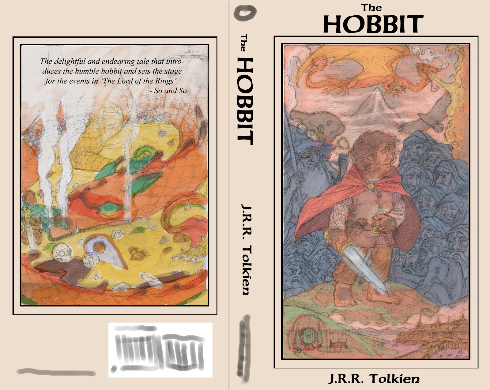
I forgot to blow the drawing up so when I shrank it down the painting would tighten up at its normal size. Sooo, this reproduces well at half its size. That's okay, though. It ends up being about 5"x6.5", which means it's nearly cover size. HOWEVER, the dimensions are closer to a magazine proportion. So, in the end, I'm calling this a glorified colour study, lol. Which it is, anyway. It was an experiment and has the little thumbnail I used to layout the final design in the bottom left corner.
Wednesday, February 22, 2012
1st Cover - 'The Hobbit' Final Cover layout and Detailed Colour Study

Okay, so I just got back on here and checked my last post and saw that Chuck and Christina had gone to the trouble of commenting and I didn't respond! I hadn't visited the site in awhile due to business. However, it seems that your concerns were my own, for now I am come to you with the changes you specified, only I left in the shield.
So, here you go :P Sorry I didn't get back to you guys. I forgot about my post. I've been so worried about the front cover image I spent days changing things (removing mostly :P) but to now avail. Christina, you should have said something on Facebook. I would have checked here sooner :P
Friday, February 17, 2012
Finished Smaug Drawing and a Recent Front Cover Update


Just finished the back cover drawing of Smaug for 'The Hobbit'. I am working on tightening and making any big changes to the front cover. Here is a recent version with the dwarves all finished. All the characters are famous illustratours that have influenced me in a big way. If any of you have Facebook, you can see who I've tagged there. Otherwise, I'm just going to make a list here.
The Brothers Hildebrandt are Fili and Kili, Pyle is Dwalin, Whelan is Balin, D.K. Sweet is Bombur (he was a big dude), Waterhouse is Thorin, Durer is Nori, Parrish is Dori, Michaelangelo is Ori, Alan Lee Oin, Howe Gloin, Pogany Bofur, and Elmore Bifur. You'll all have to wait to see who Gandalf and Bilbo are :) More to come, very soon. Will probably post the finished cover drawing later today.
Monday, February 6, 2012
After a Slight Delay...


Well, I had finished a monster project and started my cover portfolio, only to be dragged back into the former commission. Now I am done and back on track. Here's the final back cover sketch prior to reference, as well as the final rough layout of the

Thanks,
J.D.R.
P.S. I'm pretty psyched. The back cover image employs the 'Windmill Principle' James Gurney spoke of in his investigation of tonal relationships in 'Imaginative Realism'.
Friday, January 27, 2012
1st Cover - 'The Hobbit'


Hey, guys, here is the in-prog work for my first portfolio cover piece. I am doing 11 covers to various books. I have supplied the first sketch, sans reference (I still need to shoot pics for this

J.D.R.
P.S. As I worked with this image, I was very unsure of how to proceed. There are some images I don't mind filling the whole cover. Others just don't seem to fit the bill. I also kept thinking, 'Even if I liked this painting, I would not pick this book up off the shelf. I started thinking of all the books I like and what is aesthetically pleasing to me. This final cover layout will change, somewhat, but this is pretty much it. I'll likely do my own text, probably based off of the writing on the map inside the book. Or I may just do something based off of this type-face. I really enjoy it. As for the back cover, I knew I wanted something designy, but related to the front cover in some way. Smaug likely won't break the frame in the final, but this is what I was thinking, in a nut shell. Smaug curled around his pile of gold, his smoke and tail (or maybe just the smoke) curling around the border. Either way, the back image will be bound by the same border as the front. Also, not too keen on the black I used for the text and border around the front cover image. I'll probably choose something more subtle.
Thursday, January 26, 2012
'In the Spirit of the Year of the Dragon'


Here are some sketches for you guys. Christina had mentioned if anyone else had been so inspired by this year's patron beastie. I guess I have been because my sketchbooke has been quickly filling with writhing tails and gnashing teeth and gouts of searing flames (not to mention maidens in distress :P). Enjoy! Smaug, the King of dragons, is a disgarded cover concept for 'The Hobbit'. The other Smaug is an element included in the final cover layout I chose. The other image is just a sketch.
Tuesday, January 10, 2012
Dude, where have I been?


I finally got some internets, so I'm going to be around more :P Just thought I'd come over, throw something up, and see what happens :P This is the cover for my brother's Christmas present. I made him a role-playing game. This is sans text, pencil drawing with digital overlay, and eventually printed.
Hope you're all doing well :)
J.
Wednesday, September 28, 2011
Middle Sea Blog

Hey, guys. I've been out of circulation for a bit. My internet's down. I'm going to post more, starting with a project I'm doing when I have some down time. I'll post my new map, soon, too. TAG's got me working on another project for their Hellfrost setting.
Here's the link to my blog: www.middleseachronicles.blogspot.com (I can't remember how to hot link things, so unless Christina fixes this, please copy and past the link)
The purpose of this blog is to explore lots of ideas and materials and just have fun. It's a place for me to feel no pressure about art and let loose when I need to.
Enjoy, guys! See you at lunch, soon!
J.
And one image from the blog, just so there's some art up in this post :P)
Monday, August 15, 2011
'Whimsy', or, 'Come Ye Unto These Yellow Shores'


Hey, guys,
This is another illustratour piece. I'd like some critique, if you have any. I am going to stop for a minute and finish this when I hear back from some of you and my friend in Connecticut. Impressions? Likes? Dislikes?
I also included some of the sketches/studies I did for this piece.
I'm really happy with how this piece turned out. Making some changes based on the critiques of some of the awesome people from this blog, and from my best friend, Chris, and from my own observations, I was able to come up with a very unified image I can beproud of. I am really happy with the change in the cloud location. The one touching both the boat and the castle. You can see in the first images, that cloud was awkwardly tangent in several places. Just nudging it a little to the right made all the difference in the world and helped to create a convincing sense of 'space' and develops a heirarchy of shape from foreground to background. The changes I made to the ship helped it to become to centre of focus while not coming off too strong, or heavy handed. I made a change I did not post here, where I really cranked up the ship. It was a lot more complicated in design, and a bold blood red. It was very strong and hard to look at. Toning it back down and removing some of the design elements helped a great deal. I hope you guys like this. And feel free to critique away! It's not perfect and I can use the information for later pieces (this one is finished, for now).
Friday, August 12, 2011
Thursday, August 11, 2011
Vectour Dragon
Wednesday, August 10, 2011
Prodigal Son


Hey, guys,
It was brought to my attention that I was absent for a long time, and people noticed it :P Very kind of you. I've just been super busy. I have a couple big commissions, on top of a busy next couple of weeks preparing some new pieces for a portfolio to pitch to a Connecticut-based company called, Melissa and Doug.
I AM working on my own stuff, too. I have several pieces for you guys, actually. Some old school, some new for me.
The character sheets are from the book my friend and I are making. We actually have a publisher, now, who can market us broaden our customer base. This is going to be one kick ass product, guys. No joke. I can't wait to finish it! These characters are hand-drawn and inked, then plunked into the character sheet format (that was also hand-drawn and inked) using Photoshop. I wanted these to feel like old school character sheets, with a bit of a twist. Going for nostalgia, here :)
The map is from an AD&D campaign world I am preparing adventures for. It's a combination of hand-drawn inking, and colour and parchment effect in Photoshop.
The Woman is the same technique used for the map and will be a portfolio piece for my M&D interview.
Enjoy, folks! And sorry for being away so long. There's been a lot of work from you all, lately :) It all looks so nice. I'll comment when I grab another second. I'm working on a cartoon dragon and princess, today, in Illustratour CS2. When I take a break, I'll look around and write some replies :)
Wednesday, April 13, 2011
Rough Interiour Layout for 'Epic Tales'
Tuesday, April 5, 2011
Monday, April 4, 2011
Calendar Cover


Hey, guys, I'm working on a calendar for 2012. This is the cover sketch I came up with. Any feedback would be great. I also uploaded a more detailed sketch in which I tweaked some tangents and laid in some text to hold the spot till I find the type-face I want. This is a really fun project :) Can't wait to see how the months are gonna turn out :)
Thanks,
J.
Monday, March 28, 2011
'Epic Tales' Cover Page Design


Hello, all :) I'm pleased to present to you the final design for the 'Epic Tales' adventure series for Labyrinth Lord. A friend and I are co-conspiratours in a project to be released through my company, Epic Werkes Studio. These adventures will be the forerunner to my own, personal, project. Each cover will feature the same layout, but the colour background will change depending on the image. The images for each adventure will be free to break the bottom and sides of the framed space. The circular region before the book will feature the number of each adventure in the series. My friend is the writer, I am the designer, illustratour, and layout person. So, I am in charge of figuring out the consistent format each adventure will follow. The logo (with the book, but not the banner) will be able to be used, separately, to advertise the product. In some cases, the banner will be present in ads. Currently, the adventure is already written and in the editing process. I have cleaned up the text and made a few changes to the serifs and kerned some of the lettering. I have also transferred the banner and logo and begun painting them. Then, I will set up the layout for the book in Indesign. These are intended to be pdfs, and will be able to be downloaded from RPGNow. I am designing a full front and back cover so that they may be printed in their entirety. This way I can take physical copies to conventions and hand out as promos to gaming stores... Plus, I am not a fan of pdfs. I hate reading things online :P The tentative release date is the end of the Summer. There is lots of work to be done :) I've also included a file of the cover mock-up. It's rough, but it should give you guys an idea of the final design, with the painted logo in place. The logo is in watercolour. The image is an old pic I pulled from some work I did a while ago. It serves only to fill the space and give an glimpse of the final layout with a 'real' image in place.
Subscribe to:
Posts (Atom)