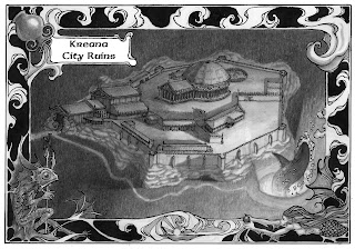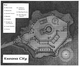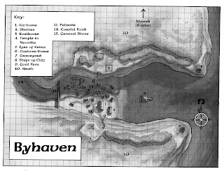


These are the pieces that led me to the mouse piece. These are new explorations in inking techniques for maps. I made some personal explorations that led to new milestones. All of these are ink washes and linework on Bristol paper. The biggest breakthrough for me, here, was the fact that I got the values I wanted on the originals and didn't have to do any manipulation in the computer. I hated the fact that I was missing the mark on the value structures in the original work in some of my former commissions for these people. Plus, the last map I made was the one with the decorative border. I had this idea at the beginning of the project, but saved it till the end for the 3d map. I wanted to experiment with some Art Nouveau techniques and explore some ideas I'd had from looking at Stephen Fabian's work. I didn't use a perspective grid on the 3d map, either. A choice I somewhat regret. It's a subjective map from a pre-medieval time, but I still think it could have benefited from some perspective. Let me know what you guys think. Chuck, be honest :P

These were laborious, but I loved the process. I drew the grid out for the aerial view maps, then translated, in pencil, the information from the schematics my employer sent me, then got my reference material, then elaborated on what was already there. I think these are a bit dark, for my tastes, but I was generally pleased with the effect. Future maps will see more detail, maybe less linework, though I liked the combination in the 3d map. I used the lines to distinguish the focal points/artificial/man-made elements from the things that were secondary/natural. That way, when you look at the map, you go, "Oh, a city! ... And a shark... and a rock outcropping... and the border..." I was impressed by a map John Howe made, featuring an illuminated map of the Wilds from "The Hobbit". His border was more subtle than mine was, but I wanted the effect that struck me most. A window frame that makes the viewer feel as if they are watching from a removed space. My goal was to have the border be detailed and elabourate, contrasting with the more naturalistic image inside it, and at the same time being secondary to it. I wanted the viewer to see the frame last. Kinda like each element is a treat for the eyes. You look at the map, rove around the various buildings, the shark, and the dramatic lighting, then notice the border, which, when paid attention to, offers other clues to the secrets of the map. The fish man is one of a race of similar creatures living in the complex. The mermaid is part of a group that strives with them, and the vessel pouring water is the holy symbol of the god that sent the temple complex/city sinking beneath the waves many centuries ago. I wanted the waves to wrap around and integrate into everything, finally culminating in the bottom middle detail where the wave swallowing the sun could be construed either as an allusion to the city's ancient fate, or the desire of the city's inhabitants to crush the surface dwellers by having their revenge on the sunlit world above their aquatic demesne.
ReplyDeleteA lot of time and love went into these and it shows!
ReplyDeleteI love the Nouveau-styled border. You've blended it with Celtic and Victorian-styled elements, and it all works together nicely.
I also like the Byhaven map. Great blending of a bird's-eye view and a map. The shadow is effective. I'm not sure the grid is absolutely necessary, but it doesn't detract.
If you find yourself doing a lot of work like this, you may want to broaden your array of historic fonts. Using the same font for everything screams "computer". By using a decorative font for shorter words and headings, and a simpler one for text and lists, you can add variation and complexity and still keep things legible. Try peppering your graphics with simple ornaments, borders, corners, or initial caps to achieve a handcrafted quality quickly. You don't need to overdo it. A little goes a long way. The LOTR video sets did this stuff very nicely.
I found a fonthouse that has a large selection of historic fonts, but I can't attest to their quality. I think they have a trial feature, so it can't hurt to check them out
http://www.fontcraft.com/artype/celtic/
Thanks, so much, Chuck. One of the reasons I went to CCAD was because they had perspective and typography CLASSES, not just little blurbs of information in foundation courses, like at UC, unless you take Product Design. My goal is to do EVERYTHING by hand. So the mouse piece will feature my own letter designs. I'm sure these fonts will help me. Thank you :)
ReplyDeleteThese were a lot of love and time. The grid is for the sake of the players who will be looking at these maps. In previous maps I somewhat considered the design of the grid in relation to the rest of the image. I was more concerned about the illustrations I was adding to the maps. I worked as hard as I could on those maps, but my goal with every piece is to make it better than the piece before it. After all, Picasso says, "The last thing you learn when making a piece of art is what to put first" :P That sticks with me and is always a consideration. If I don't grow between pieces then there is no point. Art is a lifestyle and part of who we are as creative individuals. It should grow as we do, art and person are inseparable.
Thank you, Chuck. These were lots of fun. The most frustrating thing and the most exciting thing about this company is that they just let me do what I want. I like information, details to make my images as meaningful and relevant to the worlds and characters I am illustrating. They hardly supply ANY information. They give me a little blurb in the brief, so I end up asking for the source text. For the Hellfrost map of Rassilon, I read the entire 100+ page Gazetteer as I was working on the image. So when you look at the little cities and other elements, they are mini representations of locations and metaphoric stylistic elements.
The stylistic elements is something I have been working on, too. I've just recently begun exploring border styles and the Rackham-inspired border around images and how I can play with the composition to make the two interact, as in the case of the bubbles and the shark in the 3d map image and the smoke trail in the mouse piece.
Will have some more stuff up soon.
Thanks :)
I'm with you. I need to see the big picture before I can comfortably design anything. Fortunately, most of my clients are pretty good about answering relevant questions.
ReplyDeleteA good reference for maps and drawing architecture are those DK eyewitness travel guides.
ReplyDeleteHere is a website of one of the artists who does them: http://www.thetopdraw.com/world_heritage.html
The street by street diagrams (not sure of the artist) are good referend as well.
Thank you SO much, Christina! This guy is AMAZING! I have learned a lot just looking at these images. Man, this is the next step for me. I'm going to contact him to see if he has any technique information to offer. THANK you! Seriously, this is awesome. Good looking out :)
ReplyDeleteWhere were you when I was a seventh grade D&D nerd? These are cool.
ReplyDeleteThat's why I still play :P I love this stuff.
ReplyDeleteNice, interesting pieces, Justin. From my long ago typography experience, I suggest you reduce the line space between the words in the title panel. Leave more space on the outside top and bottom.
ReplyDeleteJerry
Thank you, Jerry :) It was good seeing you at lunch, today. Always enlightening. Thanks for the quick typography lesson. We learned that stuff in college, but I think it just slipped my mind. I needed that refresher course :)
ReplyDeleteThere was a great quote from Schultz, today, about typography: "Not doing your own lettering is like Arnold Palmer having someone else hit his nine irons for him."