


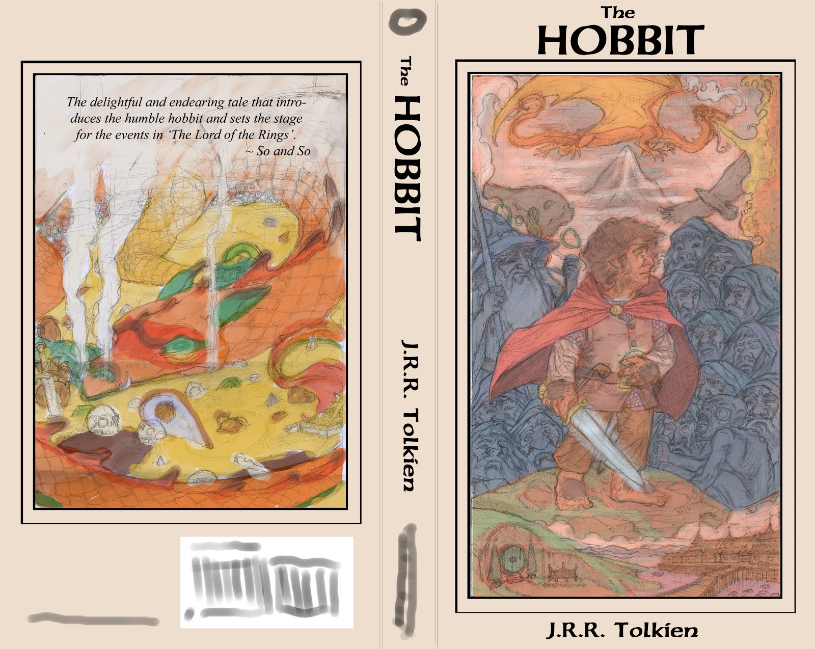

Well, I had finished a monster project and started my cover portfolio, only to be dragged back into the former commission. Now I am done and back on track. Here's the final back cover sketch prior to reference, as well as the final rough layout of the
 front and back covers.
Thanks,
J.D.R.
P.S. I'm pretty psyched. The back cover image employs the 'Windmill Principle' James Gurney spoke of in his investigation of tonal relationships in 'Imaginative Realism'.
This is tough since type is not my area of expertise. While I love the front and back illos, it feels like the book jacket design is a bit of an afterthought. By putting the book title in that small, enclosed space, it takes away from both the title and the illustration. They do not seem integrated.
ReplyDeleteI know how heartbreaking it can be to cover live illustration with a title, but that is a part of the design solution. More often than not, when you are commissioned to paint a cover, you will have to work with a designer/ad who is also an artist and also has a vision of the cover and perhaps a whole product line and brand.
Since this cover is a pitch to get work illustrating covers, you may want to show you can structure the design of the cover to integrate with a good type solution.
Just my 2 cents.
ReplyDeleteThank you, Christina. You are right. This IS what I wanted to do with the illustration project. I'd thought about the text IN the illustration, but decided to save that for another cover in the portfolio. I did, however, fix the layout to better represent what I was shooting for. The text felt like an afterthought because it was cramped up in that space, with no breathing room. I intended for it to be much more open than it was. I am reposting the cover with the edits that more accurately represent my intentions. If this still looks awkward, please let me know. You're the only one, as of yet, to challenge me on this project. It's a little frustrating. Thanks a lot, seriously.
ReplyDeleteI agree with the gist of Christina's comments, although I think the type can be within the illo, restricted to a border, or overlapping both.
ReplyDeleteThe main thing is that it has a handcrafted quality and lots of detail —in keeping with the subject matter. Be very careful of script fonts that are based on hand-drawn uncials, but look too clean and computerized.
Don't get frustrated. Graphic design of this sort is very hard and can be very time-consuming.
I'd recommend looking at books and art that integrate type and illustration well. Start with Walter Crane and Maxfield Parish. Pilfer from old illuminated manuscripts.
Even recent books by Brian Froud, Tony Diterlizzi and Lemony Snicket are great for graphic inspiration.
Look beyond the obvious and have fun with it. I was recently browsing at Half-price books, when I came across this one for 4 bucks.
http://www.amazon.com/Auntie-Tigress-Other-Favorite-Chinese/dp/B005M4SB82/ref=sr_1_1?s=books&ie=UTF8&qid=1328708651&sr=1-1
The cover design is okay. The details throughout the interior are incredible.
Why books like this don't get Caldecotts, I'll never know.
BTW, since this is for your portfolio, have you considered calling it "There and Back Again"? It could be fun to make it look like the very first copy ever written.
I forgot to mention. I love those b&w thumbnails.
ReplyDeleteTaking advantage of value ranges is something Loren Long does especially well. Particularly in his earlier books like "I Dream Of Trains", and "the Day the Animals Came".
Chuck, you're a genius...
ReplyDeleteI think a lot of politics go into winning something like a Caldecott. It is like a Hugo award for art, the same people always win (and very few women are honored)...
ReplyDeleteAgreed.
DeleteThere are Caldecott winners that really deserved them: Sendak, Ed Young, David Wiesner, Ezra Jack Keats, Jerry Pinkney. And there are great artists who've never won (Dr. Seuss)
DeleteI guess it goes without saying that all these contests are political or at least extremely subjective, and frankly it doesn't matter to me if the winners are male, female, black, white, etc. What bothers me is that (I thought) Caldecotts are supposed to reward great art, and Newberries (sp?) honor great writing. I don't see that kind of distinction in the winning books.
One of this year's Caldecott winners was a book about a Mexican artist. I checked it out of the library. The writing was okay, but I was amazed at how lazy and stiff the illustrations were. Digital in the worst way —with lots of cloned heads, so very contrary to the subject matter.
I'm glad there are other ways of getting the word out about excellent books.
This book is amazing, Chuck. You should hit the lunch, soon, and bring it. Or I might just procure myself a copy :P This looks amazing. And, you're right, the corporate media really doesn't know what it's talking about. Trends aren't necessarily good for us. It'd be nice to see some personal visions out there making headlines and getting some credit in lieu of some of the crap that's being published, lately.
ReplyDeleteI love playing with value. Value is a struggle for me, sometimes, but I have found that playing with it in abstract ways lets me figure out a more subtle way of manipulating eye movement and pattern. My goal is to make narrative (often implied), colour, value, and composition all work together to form a unified, harmonious whole.
I recently stopped working for TAG because I wanted to explore these elements in more detail. I don't care if I am losing money, but I am giving them my soul for paltry compensation (which is not necessarily bad. If the project's cool, I would like to do it. But the fact is, this is my livelihood. I am not going to make it in gaming, nor would I want to). I discovered that the amount of time I had to spend on an image was not suitable to my tastes. Gaming is too quick a turn around. Covers were always what I wanted to do. The nature of that business lends itself to more creative and interpretation of themes and expression, I think. Plus, the world needs cover painters with the amount of photo-shopped crap that hits the book shelves anymore. I can't stomach going into the main-stream book stores anymore for that reason.
Half-Price is amazing, man. Awesome deals there. I just hope they don't go any more corporate than they have been. Or at least keep their small-town, hole-in-the-wall feel. Congrats on your find, man!