Showing posts with label animals. Show all posts

Wednesday, February 18, 2015

Year of the Goat —or Sheep


A bit of levity for the snow day: This isn't a tradition I adhere to religiously, but when Chinese New Year rolls around, I get into doodling rats, dragons and other animals of the Chinese zodiac. This year we say goodbye to the year of the horse and hello to the sheep/goat/ram. 
Chinese New Year coincides with the beginning of Lent this year, so an Ash Wednesday goat seemed apropos.

Sunday, April 20, 2014

Happy Easter!

I've been trying to sharpen my competence with vector-based art. This Easter greeting was created start-to-finish in Illustrator —something I rarely do.


Not ready to throw out my pencils though.
Happy Easter everyone!

Tuesday, April 1, 2014

Thursday, February 6, 2014

Alphabet Series

I've started an alphabet series that I've wanted to do for a long time. Surprisingly enough, I began with the letter "A". Up next, Bunnipipes.

Sunday, January 22, 2012

Happy New Year!


Had a little time for doodling this afternoon. I've always wanted to sketch my own version of a Chinese Dragon. Now I just want to create more.

Tonight ends the year of the rabbit and begins the year of the dragon —the luckiest symbol of the zodiac. In Chinese tradition, dragons are charismatic, aggressive and succeed at everything they do.

almost everything.


---------
Update Jan 23, 15:26

Typically, when I post, I put art up and then move on, but in the spirit of fun, I've decided to make this an ongoing project and continue posting dragon sketches until Chinese New Year ends on Feb 6. —or until I get tired.


Jan. 26

Christina's dragons are sweet and cuddly, Justin's are strong and awesome. Mine are cynical curmudgeons. Hmmmm.


Monday, November 22, 2010

Gators and Tikis


This summer, I had the unique opportunity to design a trademark logo for a local restaurant. There were a lot of changes in direction along the way, and my earliest and kitsch-iest sketches weren't used, but I'm happy to say that I did take the project to completion and I hope to show the final logo in a future post. For now, I thought some of you might enjoy some of the sillier unused designs

there are a few more on my blog:

Monday, November 15, 2010

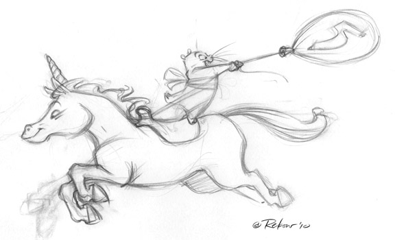
The Worst Sketch...

...you may ever see on this blog, is in this post.


It's taken every ounce of humility I've got to post it, but I wanted to respond to Christina's recent posting about the creative process.

The art above is something I did last week for my daughter's birthday. She asked me to make her a drawing with a unicorn and a hamster, and I immediately bristled at the thought of combining two animals so different in scale. Unfortunately, once you tell your 5-year old she can have whatever she wants for her birthday, you're pretty much stuck (In fact, I think that's how John the Baptist died, but I digress.)

Here's the eponymous sketch:


Most of my art starts with a really awful, but useful thumbnail. (Actually some aren't even useful —just awful.) In this case I couldn't stand to look at it long enough to finish it, but it was enough to tell me the concept was okay, and it stood as a rough guide for the work ahead.

After pulling a few images of horses in steeplechases, I got a more refined sketch. You can see that I'm still making decisions about the placement of the front legs. A lot of my rough sketches have three or more limbs.


One the sketch is scanned, I tear the elements apart in Photoshop and nudge them. It's nice to be able to make these refinements without re-tracing the image. I've always found that something gets lost with every iteration.


Here's a cleanup based on the sketch above:


In the final image, I've actually superimposed the cleanup over the early sketch.
I don't use this technique much for my commercial work, because it looks too sketchy for most clients, but I like it for personal stuff. My preliminary work almost always hits these stages though, and I keep most of the nicest sketches. (about 10% of the total)

Wednesday, August 4, 2010

Mammoth Cave


This is a T-shirt design I created last month for my cousin's Boy Scout troop.
I had a lot of fun with it, so I posted it on my blog, along with unused sketches like the one below, and far too many details about how the design came to be.


Wednesday, May 19, 2010

Similac —Yet Different


This was meant to follow Daryll's series of characters that never made the cut.

Several years ago, a local branding firm asked me to create some character designs for Similac baby formula. Similac had been using a pretty generic teddy bear on their packaging since the 90's. The design team thought it was ripe for a reappraisal. (I agreed that the bear was a bit short on personality and resembled too closely the teddy bear from Snuggle fabric softener.)

I created about 4 or 5 quick color concepts in a matter of days —all pretty different; but in the end, it was decided that there was too much equity in the existing character, and they didn't want to risk a radical change. The design firm knew going in that the chance of a redesign was slim, so they didn't budget much for my art. I met their price, but kept the rights to all the unused work —so if anyone out there knows a company in need of a bear character, let me know!

Tuesday, December 29, 2009

Giraffe


This watercolor piece was commissioned to be simply hung on a wall —a real rarity for me. The only stipulation was that it should feature a giraffe, so I snuck the little fella in the background (that's him behind the goose).

Tuesday, December 22, 2009

Aak! More Christmas Cards!

I rarely make time to produce illustrated Christmas Cards for myself, but I've done them for others in the past. Here are two I created for The Merten Printing Company way back in the mid-nineties.


The accordian-fold reindeer card was created in 1995. Jim Borgman had been designing Merten's cards in years prior, and I really felt the pressure. Knowing I couldn't compete in execution, I went for a funny concept, and pulled it off as best I could. The words "Happy Holidays" were authentically created by carving potatoes and printing them on paper before scanning them. I had fun exploring every possible way of messing up a potato print and drawing the reindeer to correspond to each letterform. Note the nod to David Carson, who's fame was cresting at that time.

Two years later, I designed the elf card below, and wisely decided to go bolder with the color.


The elf was originally named Skippy the elf (after president, Skip Merten) to the apparent delight of the pressmen and production staff.
Skip had me change it to "Pixel" anyway. :-D

These were a lot of fun and I'm posting them as a tribute to Skip, who continually gives and gives and gives to this city and has taught me more about printing than any teacher or mentor ever could.
Cheers!


Monday, December 14, 2009

Bulldogs


A few logo concepts for a new client who trains basketball players. Obviously these are sketches, so there will be plenty of finessing. It's been a really fun project, and I hope it continues to go as well as it has thus far. I'll have a lot more to tell about it later. All I can say right now is that the client is pleased.

Monday, November 23, 2009

Sunday, September 27, 2009

Never Forget


This is one of the few unused sketches I created this summer while working on a book for Reader's Digest. I hope to post more from that project once it goes to press.

Wednesday, September 23, 2009

Smart Seal


Here are some color variations of a seal character I created for a line of pool-coating products. This is pretty old stuff and it lies somewhere between illustration and logo design, but I thought I'd post it anyway while I'm waiting for some recent work to go public.

There's a bit more about the project on my blog.

Wednesday, July 29, 2009

Night two with the Tablet

Adding more details and playing with some color. I need to add a bunch more of those little sloth looking monkey babies.


I thought I'd try a different composition than normal. I'm thinking a mural shape. I like playing cards, I like the outdoors and animals so why not combine them all. This drawing tablet is going to cause me to lose a lot of sleep, hard-drive space but hopefully open up new doors for freelance, as it should cut down on expenses of shipping, sketching materials and time spent transferring sketches to boards, prepping and scanning.. Whew.
Gabe.

Saturday, June 27, 2009

Chalk Dog


I still have a lot of studio work in non-disclosure limbo. Since I usually retain all the rights to my driveway art, I'll share this weekend's piece.
You can see a straight-on view at the chalk-o-holic blog.

Thursday, May 21, 2009

A Bird in the Drive


I've got some commercial work brewing in the studio, but nothing I can show right now. In the meantime, I thought I'd post a pic from my "chalk-o-holic" blog here for you to enjoy.
Just having fun in the driveway with the kids.

Saturday, January 31, 2009

Animal Tracks

I JUST got the printed sample of this in the mail. It is the November/December issue of Scholastic News. They did a great printing job!

It was fun to paint a Canadian Lynx. Despite the variety of cats I painted for Big Cats, this species was not one of them.

Below is what the printed issue looks like.