

Showing posts with label Chuck Rekow. Show all posts
Showing posts with label Chuck Rekow. Show all posts
Sunday, July 15, 2018


Wednesday, February 18, 2015
Year of the Goat —or Sheep

A bit of levity for the snow day: This isn't a tradition I adhere to religiously, but when Chinese New Year rolls around, I get into doodling rats, dragons and other animals of the Chinese zodiac. This year we say goodbye to the year of the horse and hello to the sheep/goat/ram.
Chinese New Year coincides with the beginning of Lent this year, so an Ash Wednesday goat seemed apropos.

Thursday, August 7, 2014
Sketches of Biblical Disproportions
It's hard for me to find work I can share on the blogosphere, but today I've posted a series of sketches on my blog from a ongoing project for a faith-based publisher.


There's some brief text about the challenges of treating Biblical subjects in cartoon form and why studying the Old Masters is not always helpful.
Sunday, April 20, 2014
Happy Easter!
I've been trying to sharpen my competence with vector-based art. This Easter greeting was created start-to-finish in Illustrator —something I rarely do.

Not ready to throw out my pencils though.
Happy Easter everyone!

Friday, January 31, 2014
A Night of Sketching at Modern Makers + The Cincinnati Ballet presents Dance/Draw
 |
| Sketch by Christina Wald |
It was an amazing event with some great dance demos from the Cincinnati Ballet and a couple students from CCM. There was a lot of good sketching time as the dancers warmed up.
We mostly did gesture sketches at the event and I did the sketch to the left when I got home.
See more sketches and pictures here on Amy's blog and here on my (Christina Wald's) blog.
I hope they do more events like this.
 |
| Beautiful gesture sketches by Amy Bogard |
 |
| L-Chrisitna Wald; R-Amy Bogard |
Sunday, January 22, 2012
Happy New Year!

Had a little time for doodling this afternoon. I've always wanted to sketch my own version of a Chinese Dragon. Now I just want to create more.
Tonight ends the year of the rabbit and begins the year of the dragon —the luckiest symbol of the zodiac. In Chinese tradition, dragons are charismatic, aggressive and succeed at everything they do.
almost everything.
---------
Update Jan 23, 15:26
Typically, when I post, I put art up and then move on, but in the spirit of fun, I've decided to make this an ongoing project and continue posting dragon sketches until Chinese New Year ends on Feb 6. —or until I get tired.

Jan. 26

Christina's dragons are sweet and cuddly, Justin's are strong and awesome. Mine are cynical curmudgeons. Hmmmm.
Friday, October 28, 2011
Manifest Studio Wall

It's been awhile since I last gave a plug to Manifest.
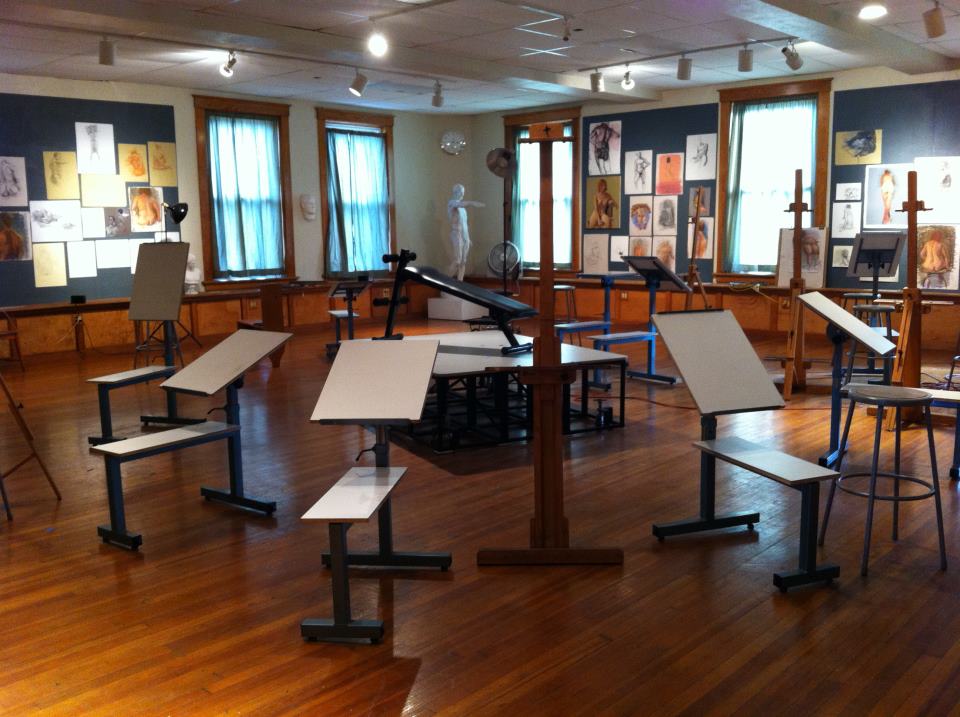
One of the things I like about the drawing studio is the way artists are encouraged to pin up their art. While I'm drawing, there are always numerous examples of great work looming over me that inspire and otherwise bolster my efforts by setting the bar very very high.
These photos were taken at the old studio in the Essex building. The artwork on the walls was accessible to the public whenever the Essex hosted one of their Friday night Artwalks.


About nine months ago, Manifest moved the drawing studio to its current location in Madisonville. The art is still pinned up and frankly, it just gets better and better. The only problem is, without a regular open house event, there is no way to view the pieces unless you sign up for drawing sessions or take a workshop. To remedy this, Manifest has created a virtual studio wall on its website. You can view samples of the artwork done in the studio over the years.
This feature is in the early stages and hasn't been getting a whole lot of action. I thought I'd help by spreading the word. I have a couple of watercolors there, and plan to post more as time allows.
In the meantime, I'm still posting recent work (like the one at the top) on my blog.
update: 1/27/12
I've found a photo of Manifest's current studio in Madisonville. I think it's a beautiful environment to work in.
Friday, August 26, 2011
Hahana Beach

I've had this on my blog for a while and I thought with all the recent posts about vector graphics, now would be a good time to share it here.
Hahana Beach is a sports bar and restaurant that hosts professional sand volleyball tournaments. It opened up on Wooster Pike a year ago this week.
Last spring, just months before the big opening, I was invited by Parkey Design to help create a logo that encapsulates what the place is all about: fierce competition and fun under the sun that continues well into the night. Influences ranging from tiki kitsch and South Beach fashion to Melanesian tribal tattoos went into its creation. The fun part was creating a strong sense of personality while limiting myself to basic geometric shapes and a single line weight.

Above is one of my favorite versions that didn't make the final cut. You can find two others on my blog.
I've taken the family to the place a few times, and I highly recommend going on a sultry Saturday evening when you can sometimes play on the courts after your meal.
The menu (which I designed as well) is posted here.
Monday, July 18, 2011
Sleeping Bear

Since I can't show a lot of my recent commercial work, I thought I'd post the latest shirt design for my cousin's Boy Scout Troop. They're camping at Sleeping Bear Dunes in Michigan.
Here's the composite sketch before going to final:

..and an unused warm-up sketch:

I left more sketches and a bit of added information here.
Friday, July 15, 2011
Hairy Potter

Never thought I'd post this, but with Potter-mania in full swing, I just buckled.
This was created for the spring issue of California Magazine. They have a running feature called Twisted Titles where they invite readers to riff on a famous book. Then an illustrator gets to pile on the irreverence some more. I was offered the chance to illustrate Hairy Potter—Hippie Ceramicist, and couldn't resist dragging the movie Ghost into the mud.
Here is another concept with Lord Voldemort as a tiki mug.
(I could have lived with that one too.)

More sketches on the blog.
Thursday, February 3, 2011
Happy Chinese New Year!

This is a detail from a two-color interior illustration for the Reader's Digest book, The Smartest, Funniest, Dumbest Things Ever Said. I've posted the full 2-page spread on my blog, along with a bit of backstory and several preliminary sketches.
I hope to post a bit more from this project later.
Monday, November 22, 2010
Gators and Tikis


This summer, I had the unique opportunity to design a trademark logo for a local restaurant. There were a lot of changes in direction along the way, and my earliest and kitsch-iest sketches weren't used, but I'm happy to say that I did take the project to completion and I hope to show the final logo in a future post. For now, I thought some of you might enjoy some of the sillier unused designs
there are a few more on my blog:
Monday, November 15, 2010
The Worst Sketch...
...you may ever see on this blog, is in this post.

It's taken every ounce of humility I've got to post it, but I wanted to respond to Christina's recent posting about the creative process.
The art above is something I did last week for my daughter's birthday. She asked me to make her a drawing with a unicorn and a hamster, and I immediately bristled at the thought of combining two animals so different in scale. Unfortunately, once you tell your 5-year old she can have whatever she wants for her birthday, you're pretty much stuck (In fact, I think that's how John the Baptist died, but I digress.)
Here's the eponymous sketch:

Most of my art starts with a really awful, but useful thumbnail. (Actually some aren't even useful —just awful.) In this case I couldn't stand to look at it long enough to finish it, but it was enough to tell me the concept was okay, and it stood as a rough guide for the work ahead.
After pulling a few images of horses in steeplechases, I got a more refined sketch. You can see that I'm still making decisions about the placement of the front legs. A lot of my rough sketches have three or more limbs.
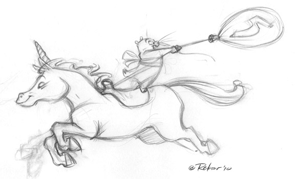
One the sketch is scanned, I tear the elements apart in Photoshop and nudge them. It's nice to be able to make these refinements without re-tracing the image. I've always found that something gets lost with every iteration.


In the final image, I've actually superimposed the cleanup over the early sketch.
I don't use this technique much for my commercial work, because it looks too sketchy for most clients, but I like it for personal stuff. My preliminary work almost always hits these stages though, and I keep most of the nicest sketches. (about 10% of the total)
Wednesday, September 15, 2010
New Loren Long Book Out this Fall: Of Thee I Sing: A letter to My Daughters

The press release says the print run is 500,000 which is huge for a picture book. The cover looks great! I look forward to seeing the rest of the illustrations.
I am sure there will be signing events coming up for this. I will post them as I find out further information.
There has been quite a lot of presidential illustration action by local illustrators. C.F. Payne did the Time cover immediately following the 2008 election and he and several other artists have done portraits of many presidents for various publications. Chuck Rekow illustrated a book several years ago for kids called Kids' Letters to President Bush. Very cute. It is unfortunate the new edition Kid's Letters to President Obama is not illustrated, same author though...
Wednesday, August 4, 2010
Mammoth Cave

I had a lot of fun with it, so I posted it on my blog, along with unused sketches like the one below, and far too many details about how the design came to be.

Monday, June 28, 2010


Wednesday, May 19, 2010
Similac —Yet Different


This was meant to follow Daryll's series of characters that never made the cut.
Several years ago, a local branding firm asked me to create some character designs for Similac baby formula. Similac had been using a pretty generic teddy bear on their packaging since the 90's. The design team thought it was ripe for a reappraisal. (I agreed that the bear was a bit short on personality and resembled too closely the teddy bear from Snuggle fabric softener.)
I created about 4 or 5 quick color concepts in a matter of days —all pretty different; but in the end, it was decided that there was too much equity in the existing character, and they didn't want to risk a radical change. The design firm knew going in that the chance of a redesign was slim, so they didn't budget much for my art. I met their price, but kept the rights to all the unused work —so if anyone out there knows a company in need of a bear character, let me know!
Saturday, March 27, 2010
Velociraptor

This is one of 4 interior illustrations for a yet-to-be-released CD by Rich Rubietta. The song is called "Run From The Raptors" and uses the velociraptor to personify the various commercial interests that prey upon today's youth. Arriving at an appropriate sketch was a difficult balancing act. We both struggled to inject the right degree of warmth and humor into his cautionary statement against rampant consumerism.
I compounded my problem by insisting that the dino should resemble the long-snouted version found in fossil beds rather than an imitation of the familiar Jurassic Park dinos. I stopped short of pushing for raptor feathers and hair.
Thursday, March 18, 2010
Un Goth

Christina's recent appeal for postings of figure drawings inspired me to add this. Not very vampirific, but I kinda like this female figure for it's simplicity and abstract qualities. There are more drawings at my figure drawing blog, and I'm hoping to add more soon.
Thursday, February 18, 2010

Thanks Christina - just went out and dug the paper out of the snow. The best thing about this poster was having the opportunity to collaborate with our own Chuck Rekow - great guy, excellent designer and consummate gentleman under pressure. He contributed the type & border design and color and the poster is by far the better for it...thanks, Chuck! I usually get vast amounts of these every year; the Heart Assoc. would be pleased to receive any contribution, and I would be pleased to deplete the number I have to store someplace.
I obviously can't figure out the formatting rules of this site, but I have to include a pic of Chuck's incredibly cute daughters and their field trip to Merten printing. It's set in stone - now that they've had that exposure to the magical aroma of ink & amp; solvent...meet two of the youngest graphic artists of the next generation:

Subscribe to:
Posts (Atom)